Infographics
ECSite
Infographic Design
Simplifying Complex Network Automation into a Clear Visual System
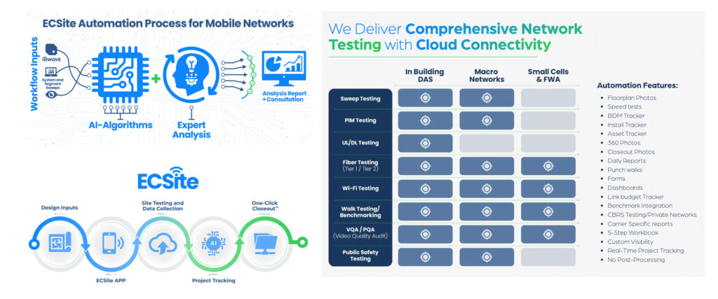
Situation
ECSite needed a clear and engaging way to communicate its automation process for mobile network testing, a complex workflow involving AI algorithms, data collection, and expert analysis. The challenge was translating highly technical information into a format that could be quickly understood by both technical and non-technical audiences.
Task
Design an infographic that visually explains the end-to-end automation process while reinforcing ECSite’s value proposition, making advanced network testing more efficient, streamlined, and accessible.
Action
I developed a structured visual narrative that breaks the process into clear, digestible stages. from inputs and data collection to AI-driven analysis and final reporting. The layout was designed to guide the viewer through the workflow intuitively, using directional flow, iconography, and consistent visual cues.
A clean, modern visual language was applied, combining technology-inspired graphics with simplified diagrams to reduce cognitive load. Color was used strategically to differentiate stages and highlight key components, while typography ensured readability across both detailed and high-level views.
The right-side framework complements the process by clearly outlining service capabilities, creating a balance between storytelling and product clarity.
Result
The final infographic transforms a complex technical process into a clear, engaging visual story, making ECSite’s automation capabilities easy to understand and communicate. It serves as an effective tool for sales, presentations, and marketing, helping position the company as both innovative and user-focused.
Buffalo Grove Park District
Infographic Design
Translating Financial Data into Clear, Community-Focused Insights
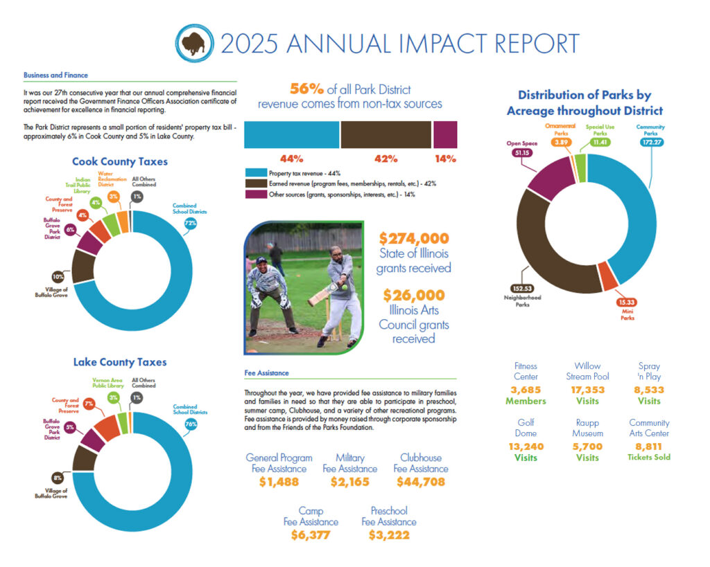
Situation
The Buffalo Grove Park District needed a clear and engaging way to communicate its 2025 Annual Financial Impact Report to the community. The challenge was presenting detailed financial data, funding sources, and program impact in a format that was transparent, easy to understand, and visually accessible to a broad audience.
Task
Design an infographic that simplified complex financial information while reinforcing trust, accountability, and the value the Park District provides to residents.
Action
I structured the infographic to guide readers through key financial insights using a clear visual hierarchy, prioritizing high-level takeaways first, followed by supporting data and detailed breakdowns.
Data visualization played a central role, with charts and diagrams used to make funding sources, tax distribution, and program impact easy to interpret at a glance. Color was used strategically to differentiate categories and maintain consistency across multiple data sets.
The layout balances analytical information with human impact, integrating imagery and program highlights to connect financial data to real community outcomes. Typography and spacing were carefully considered to ensure readability and clarity across a dense set of information.
Result
The final infographic presents complex financial data in a clear, transparent, and engaging format, helping the Park District effectively communicate value, build community trust, and make information accessible to a wide audience.