Advertisment


BUFFALO GROVE PARK DISTRICT
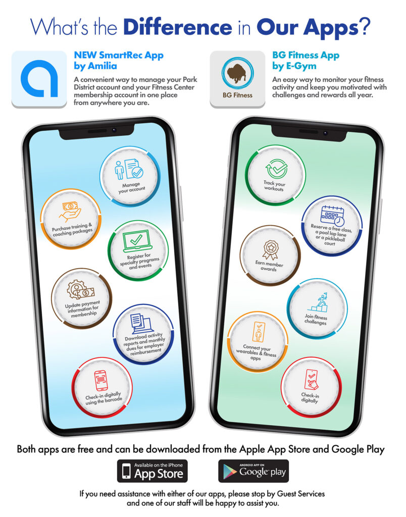
Buffalo Grove Fitness Center
Fitness Center App
Clarifying Product Differences Through Structured Visual Communication
Situation
The Buffalo Grove Park District needed a single-page advertisement to clearly explain the differences between two mobile apps, SmartRec and BG Fitness, while encouraging user adoption. The challenge was simplifying overlapping features and functions into a format that was easy to scan and understand at a glance.
Task
Design a visually engaging, easy-to-digest comparison that helped users quickly understand the purpose and benefits of each app, while reinforcing clarity and driving downloads.
Action
I developed a side-by-side visual system that clearly separated the two apps while maintaining a cohesive overall design. Each app was anchored by a mobile interface mockup, with supporting features organized in circular callouts to create a structured, scannable layout.
Color was used strategically to differentiate functionality while maintaining visual consistency across both sides. Typography and hierarchy were carefully controlled to guide the viewer from headline to features to call-to-action without confusion.
The overall composition was designed to balance information and visual clarity, ensuring that even complex feature sets could be quickly understood in a high-traffic, real-world environment.
Result
The final piece transformed a potentially confusing comparison into a clear, engaging visual tool, helping users easily identify which app met their needs while supporting increased awareness and adoption.
BUNZL
Bunzl - Jovials Advert
Crafting a Fresh, Engaging Brand Message Through Visual Storytelling
Situation
For a Bunzl Golbon conference submission, the goal was to create a one-page advertisement that would promote the Jovials brand while standing out in a highly competitive, visually saturated environment. The challenge was to communicate product quality and brand personality in a way that felt fresh, inviting, and memorable.
Task
Develop a concept-driven advertisement that balanced strong visual appeal with clear messaging, reinforcing brand value while capturing attention in a fast-paced, trade show setting.
Action
I created a clean, modern layout that paired bold typography with a vibrant, product-focused visual to immediately draw attention. The composition was structured to guide the viewer from brand to message to call-to-action, using strong hierarchy and intentional spacing.
A soft, curved layout element was introduced to contrast with the bold imagery, creating a more approachable and contemporary feel. Color was used strategically to reinforce brand identity while maintaining a fresh, energetic tone.
The messaging was crafted to connect emotionally, positioning the product not just as food, but as part of shared experiences, while still supporting a clear, actionable next step through the call-to-action and QR integration.
Result
The final concept delivered a polished, engaging advertisement that elevated the Jovials brand through strong visual storytelling and clear communication. While not selected, the piece demonstrates a thoughtful balance of concept, design, and messaging, making it a strong addition to a professional portfolio.
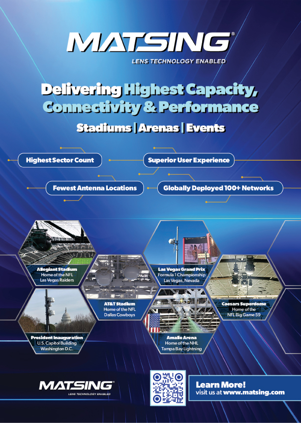
MATSING
Bunzl - Jovials Advert
Communicating High-Performance Technology Through Clear, Impactful Visual Messaging
Situation
MatSing needed a one-page advertisement to promote its lens antenna technology within a competitive telecom and infrastructure market. The challenge was to communicate highly technical performance benefits in a way that was visually engaging, easy to understand, and compelling for industry audiences.
Task
Design an advertisement that clearly conveyed key product advantages — including capacity, efficiency, and deployment scale, while reinforcing MatSing’s position as a leader in high-performance connectivity solutions.
Action
I developed a bold, technology-forward visual system that combined strong typography, structured messaging, and dynamic graphic elements to communicate performance at a glance. Key benefits were distilled into concise, high-impact callouts, supported by a clean hierarchy that guided the viewer from headline to proof points.
The layout integrated real-world applications through venue imagery, reinforcing credibility and scale, while geometric and linear design elements helped unify the composition and maintain a modern, technical aesthetic.
A clear call-to-action and QR integration were included to support engagement beyond the print piece.
Result
The final advertisement delivers a clear and confident message around MatSing’s performance capabilities, transforming complex technical information into a compelling, visually driven communication tool that supports brand authority and audience engagement.